Adding dark mode support to a webapp
NEW CSS JSMost modern webapps and programs have an option to switch between dark and light mode. In this article we will see what is the history of dark mode, how it evolved to the current level and what are the fundamentals of this feature and also how to create it for our web application.
Dark mode history
Dark mode has a long history, even though we may not know about it. Basically all the first computers has monochromatic displays where the background was black and the text was some kind of color. These colors were mainly white(ish), yellow and green. If we think about dark mode as a dark (=black?) background with some lighter text color then these first monitors has dark mode support by default. Regarding the early days Connor Ward has a great article.
As the image below shows, early displays has only two colors. One for background and one for foreground (text). Using a black background was better in these days, because the display itself was dark grey, so displaying all white background could take more effort.

Dark mode pros and cons
There are many opinions about dark mode and it’s pros and cons. There are sayings about better battery life (especially on OLED displays), better readability etc. But I think it’s more about preferability. Some people likes to wear dark and black clothes, while other prefers white. I think the same applies to dark/light mode users. However, there are a few key points which I have to mention and consider as facts, not preferability stuff.
Advantages
Battery life
This has been proven and almost 25% energy can be saved using dark mode (compared to light mode) on devices with OLED display.
Night usage
Many programmers – and in general IT guys – prefer to work at late afternoon or at night. In these cases, watching only the white monitor can cause real problems and affect the vision and even the sleep’s quality thanks to the blue light. By the way this is why modern systems have a yellow tint mode (night shift mode) where the system increases the yellow colors to help and reduce eye strain. After a long usage this yellower tint can help a lot, worth trying it out. So this is one way to work at night on our screens, and the other one is using dark mode. This is now supported on Windows, Linux (based distros) and MacOS.

Disadvantages
In my opinion there is no major thing which can be considered as disadvantage, except one thing. Using dark moded apps in a light environment can affect the readability of the display, which after a longer period can affect the eyes, and it increases eye strain.
Dark mode pioneers
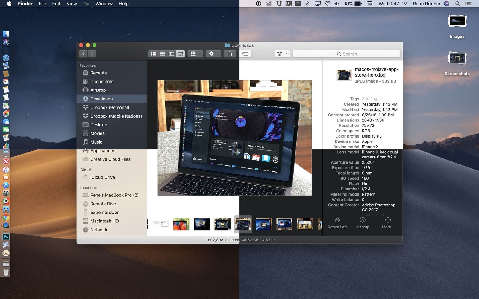
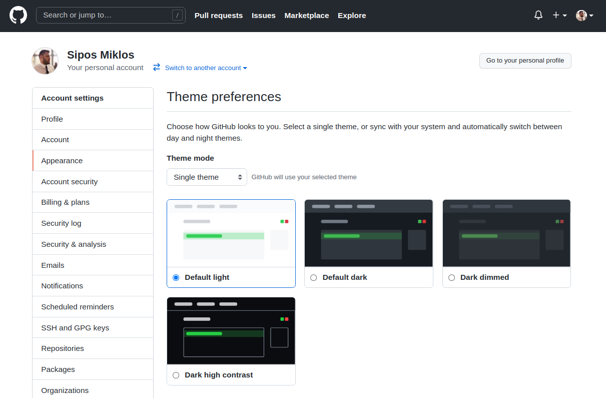
Before the operating systems implemented dark mode support the real pioneers were the websites and webapps. They were the first who created switches on their UIs where you can switch between the two modes. (Now, GitHub for example have different dark modes to choose from. This is because there is a huge number of user requests and these must be somehow satisfied.) In the past few years most user interactions were made via a browser. This was good because many webapps already supported dark mode, so there were no problem. The real pain came after, when you switches from Chrome to your file browser, and then you were blinded by the white space. This was the moment when user requests was formed regarding the operating systems so that they should support dark mode as well. Beside the webapps it’s worth mentioning that most of the developer tools eg. editors (like VSCode, Sublime etc.) had dark mode. So maybe they were the real dark-mode pioneers?! Hard to decide.
Personal preference
I recently asked on Twitter what do you prefer (it was before I implemented dark mode for my uni website) because I was curious, and the outcome was that ~83% of participants use dark mode all the time.
Használsz-e dark-mode-ot weboldalaknál ahol van erre lehetőség? (pl. facebook)
— Sipos Miklos (@_siposm) January 29, 2021
It was a good experience for me, because I personally use dark mode depending on the circumstances. Let me explain. If there is a dark environment where I work, I prefer dark theme. For example during winter when there is dark outside at 15:00 I prefer to use dark modes everywhere, but when it’s summer and everything is bright it’s easier to my eye to read and work on a light display, using light mode.
So I think the best way to jump between light and dark mode, depending on the current situation and my needs.
Moreover, I prefer the dimmed themes over the full blacked out ones. Eg. GitHub has dark dimmed version, and it’s much better – imho – for the eyes.

Designing a dark UI
Designing a dark UI is not as easy as it seems. It seems a logical step to just “darken down everything” but then you will face a problem that your dark UI is not ad appealing and good-looking as others – so what is the trick? The main point is that dark UI does not mean black UI! Some people like full dark UIs, but it’s not the biggest section. For example Apple when created their dark UI put a lot of work and time into it, and their was the best at that time.
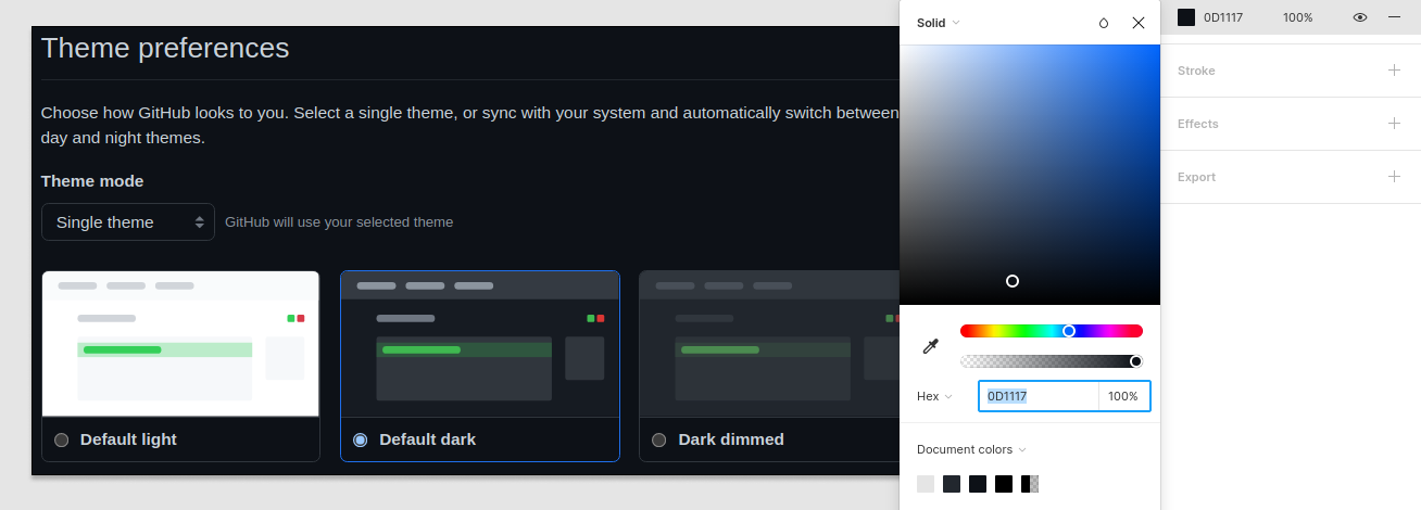
When you create a dark UI you should avoid using black. Black is the color scale’s endpoint, it rarely should be used. Even shadows (like box shadow or drop shadow) should not be black. Using colors is the professional way, but simply using different tones of gray is already a better move. This can be easily checked by taking a screenshot from a given UI and color picking the background (because it is usually the darkest).

As the image shows above what seems to be black is not really black, moreover there is color inside, so we are not only selecting color from the grayish area.
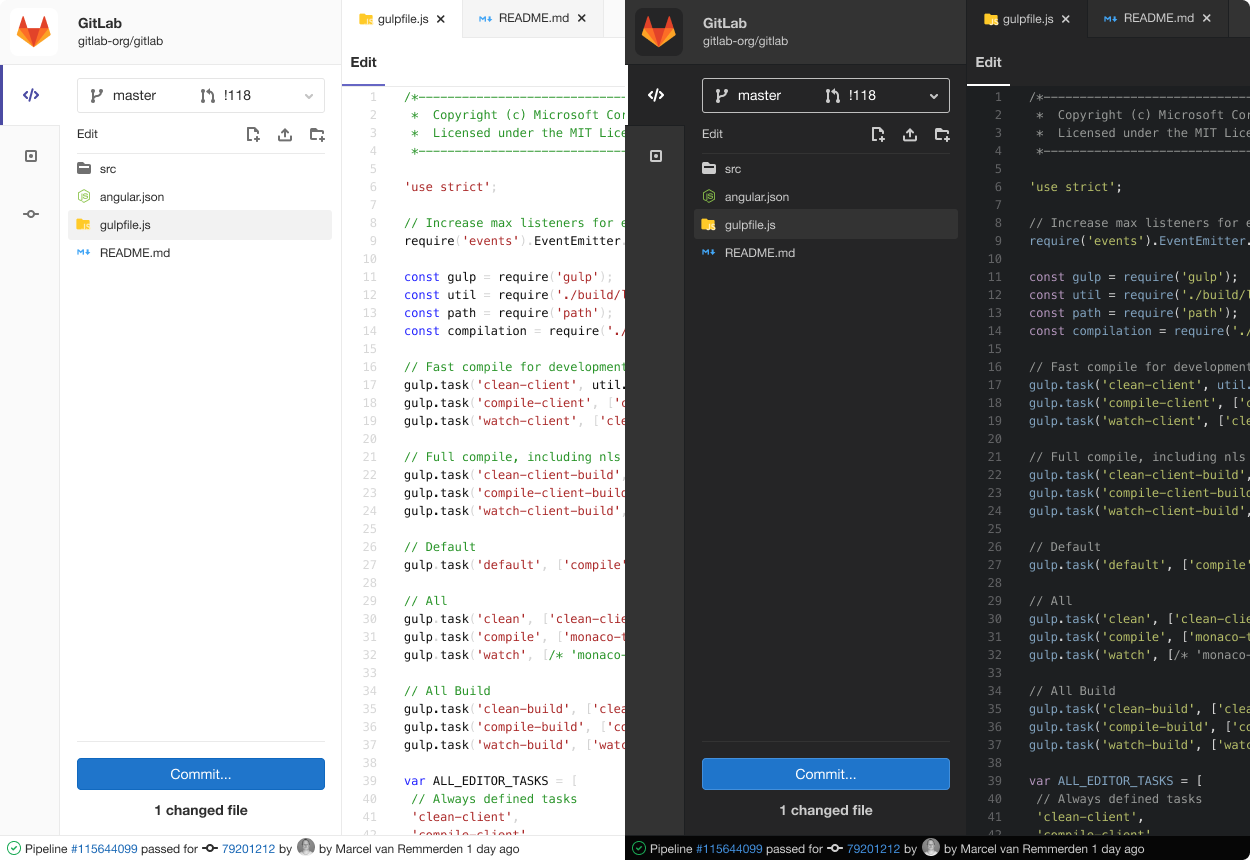
GitLab has a great official article about how they’ve designed their Web IDE’s dark UI.

Fundamental concepts
Speaking about dark mode support for a web application the principle is very simple. You have to create a light theme firstly and then create a dark theme afterwards. Then you have to create a mechanism to change between these two themes. Additionally, a good practice to add a mechanism which stores your selected theme and when you revisit that site will use dark/light mode as you left it.
So this was the tl;dr how it works part. Going for a deeper dive we will check the mentioned “mechanisms”.
Solutions
Self made version
We’ll follow the following steps:
- we will create the themes themselves as CSS files
- we will reference them in the HTML document
- we will see what is the problem with that
- we will add JavaScript to it in order to let us change between the themes at the client side
- we will add a mechanism to store the selected theme in cookies
Important note!
Please be aware that these steps below will explain how and why something should be done, but the codes will need to be adjusted to fit your needs exactly. If you copy all the codes and will not understand the steps, it won’t work.
CSS
The first thing will be the theme itself, which is described using CSS. Just like mobile or desktop first approach is a thing during development, there is a dark or light mode first approach as well. I think light mode is the preferred version in general in terms of readability for the general user, so this will be (could be) first file to create.
We will reference this in the HTML’s <head> section.
<head>
    <meta charset="UTF-8">
    <link rel="stylesheet" href="light.css">
</head>
After this, we just simply have to create the light.css file and place the needed styles. Then we can decide what to do next, because there are multiple options:
- option 1.: creating fully independent css files for light and for dark mode
- option 2.: creating only the differences, like some inheritance from light to dark
I personally prefer the 2nd way, and it has a good reason, 90% of the two themes will be the same. Menu width, body width, responsiveness and other properties will be the same and not affected by the dark or light theme. Only the colors will change. So for this reason, we will add the dark.css to the head after the light one. It is important, because whenever the page loads it will go from line to line; so firstly it will load the light.css’s content and then it will load the dark.css’s content afterwards. It means, that everything which has been created in the light version, will be overwritten in the dark version! And this is exactly what we need.
It can be hard to understand, so check out these two basic examples.
Option 1.
In this approach we will create all the styles regarding the light theme, and then basically we’ll copy the content of the file to a new file (which will be the dark theme’s) and change only the colors.
/* Light.css */
body {
    width: 100px;
    background-color: red;
}
p {
    font-size: 19px;
    color: green;
}
/* Dark.css */
body {
    width: 100px; /* these values are repeated, which can and should be avoided */
    background-color: yellow;
}
p {
    font-size: 19px; /* these values are repeated, which can and should be avoided */
    color: blue;
}
Option 2.
However, in this approach we’ll do differently. We’ll only create the differences in the second file, which will result a better code. Note that since the light theme will be the first to load, it will apply the body’s width and the p tags’ font-size to the elements. After loading the dark theme, only the background-color and the color will be changed. Thus, writing down again the width and the font-size is not needed (and should be avoided in order to have a better and more maintainable code).
/* Light.css */
body {
    width: 100px;
    background-color: red;
}
p {
    font-size: 19px;
    color: green;
}
/* Dark.css */
body { background-color: yellow; }
p { color: blue; }
So, accordingly we will create the two files and reference them in the head section just like this:
<head>
    <meta charset="UTF-8">
    <link rel="stylesheet" href="light.css">
    <link rel="stylesheet" href="dark.css">
</head>
This looks good, but still we have a problem: every time the page loads, the dark styles will be loaded and applied to the full site! So basically we do not have access to the light theme, because it is always overwritten.
For this, we have to add a disabled attribute to the dark one. It will be good for us, because it will load the dark.css content as well, but would not apply to the page.
<head>
    <meta charset="UTF-8">
    <link rel="stylesheet" href="light.css">
    <link rel="stylesheet" href="dark.css" disabled>
</head>
JS
At this moment we have a page which loads 2 CSS files, where the light mode’s style is loaded first and then the dark mode’s, but it is immediately disabled so won’t affect the site’s look – yet. Next step will be to create some client side stuff to enable / disable this dark CSS. For this we will use JavaScript.
We have to create some button on the page and add a click event listener to it. An example for that is here:
<button onClick="switchTheme()" type="button">
    Switch my theme button
</button>
Then we have to create a switchTheme method in JS. This method will be called whenever the button is pressed. After each press we have to enable / disable the dark CSS. Before the change we need to check if it’s currently disabled or not, and do the inverse of the current state. For this I used jQuery’s $ selector and added or removed the disabled attribute.
function switchTheme() {
    /* --- Add magic-logic-checking here. --- */

    /* disabled should be FALSE IF we need dark mode */
    $('link[href="dark.css"]').prop('disabled', false)
    /* disabled should be TRUE IF we need light mode */
    $('link[href="dark.css"]').prop('disabled', true)
}
Some example for checking can be like this:
function switchTheme() {
    if ($('link[href="dark.css"]').is('[disabled]'))
        $('link[href="dark.css"]').prop('disabled', false)
    else
        $('link[href="dark.css"]').prop('disabled', true)
}
After the checking logic is added after each time the button is pressed it should disable and then enable the dark.css style, so the theme of the site should change from light to dark – regarding the styles we have created in each CSS file.
Store the theme
Next step should be to use some kind of storage to save the currently selected theme. It is a good user-friendly way to help users receive the same experience when they have left. On applications where you need to login it is much easier, because you simply store in a DB what was the preferred theme, and from the server you load the theme what the user needs. But in apps, where there is no login, hence there is nothing stored in connection with the user, you have to use client side storage. For this, we can use localStorage or cookies.
After the switchTheme method is called, we have to add also some code to store in cookie this selected theme. And we have to do some extra work on each page load as well, because if I load the site which was previously set to dark mode (and it was stored in cookie for example), then I have to check the cookie and load the themes (ie. enable or disable the dark theme) accordingly. There are many ways to solve this, nothing special is needed. The key line can be found here, to get and set the cookie variable.
/* Getting the cookie. */

console.log(document.cookie)

/* and then we can check and filter for given keywords like this for example: */
document.cookie.includes("SAVED_THEME")
/* Setting the cookie. */

var d = new Date()
var exdays = 365
d.setTime(d.getTime() + (exdays * 24 * 60 * 60 * 1000))
var expires = "expires=" + d.toUTCString()
document.cookie = "SAVED_THEME=LIGHT; " + expires
/* expires simply sets to remember for this setting for 1 year */
As described above, there are many ways and solutions to add dark mode to a web application or website. These are the fundamentals, the basic principle how it works. My belief is that if you know how something works you can create it.
Out of the box version
Of course there are other solutions which offer out-of-the-box or plug-n-play like feelings. For example using TailWindCSS you just simply add dark:xxx and those styles will be applied only if dark mode is triggered. There are great and simple examples on their website, feel free to check out. (There is even a good localStorage example as well!)
<div class="bg-white dark:bg-gray-800">
  <h1 class="text-gray-900 dark:text-white">Dark mode is here!</h1>
  <p class="text-gray-600 dark:text-gray-300">
    Lorem ipsum...
  </p>
</div>
Closing thoughts
After reading this article we probably get a good feeling and insight how the basics of theme switching works. Of course, we can move forward and create 10 themes, which can be activated via dedicated button presses, or loading randomly one on each page load and so on.
This was an interesting topic, because in order to create such functionality you need to know JS, CSS and HTML. And also, I haven’t mentioned SSR (server side rendering) but it is also one key factor.
The ‘self-made version of solution’ was great because it can be easily added to any working system, without creating too big of a mess on the currently working codebase.
SSR
The above-mentioned code snippets and methods are working fine, but there could be one issue. Scenario:
- previously we have selected the dark theme
- it is stored in cookies
- then we load the page
- the page loads the CSS in this order:
light.cssand thendark.csswill be applied as well because from JS we can see that it was stored in cookie, so we remove thedisabledattribute - at this very moment the page will blink from light mode to dark mode, because it takes a small amount of time to load secondly the dark theme which overrides some styles – and this could be annoying
In order to handle this situation we have to add extra functionality at the server side, but that is a topic for another day.